
Visual identity
DEC 2023
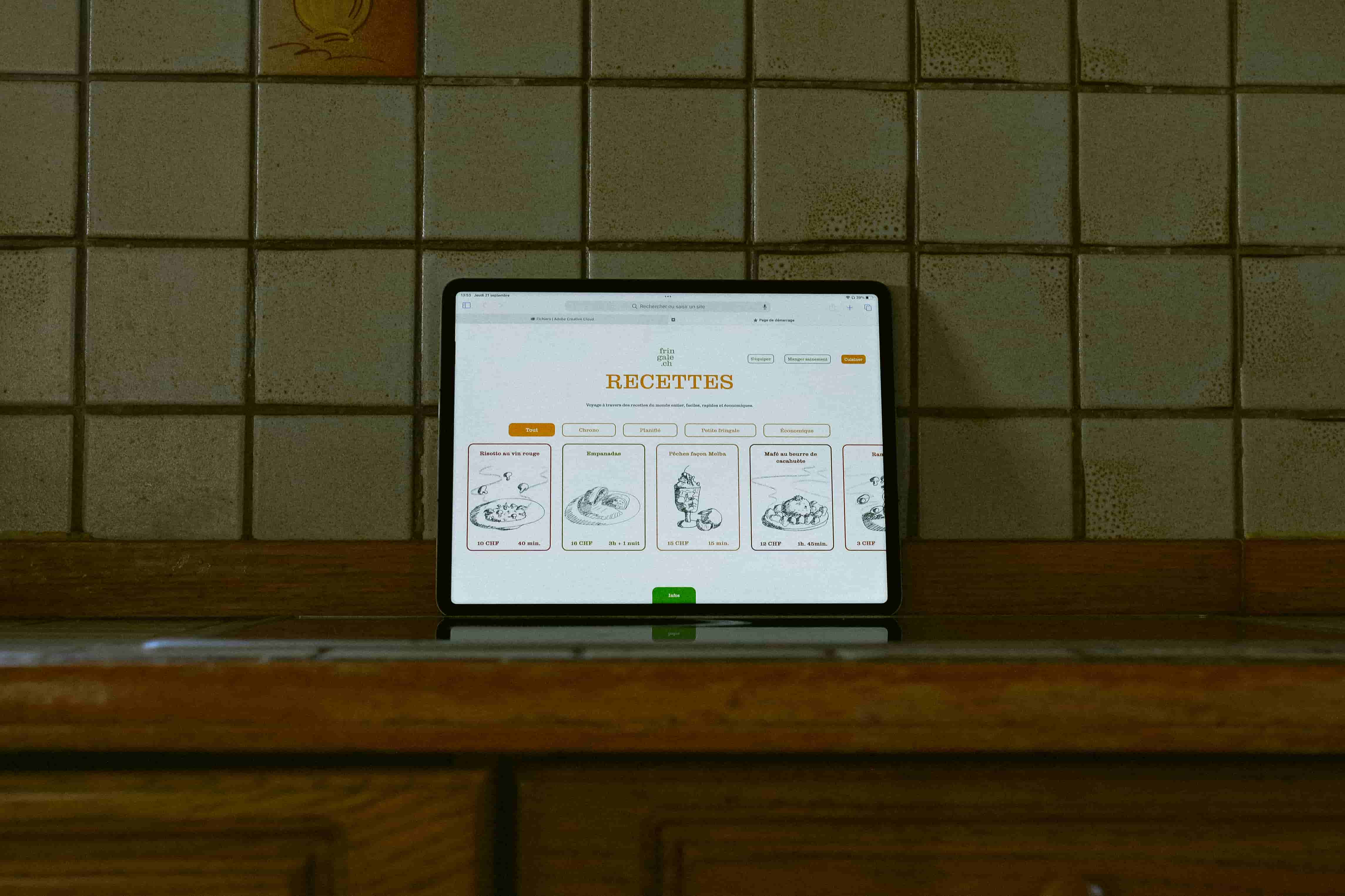
Fringale.ch is a fictitious project. The brief was to develop a visual identity including a website, a logo, a promotional video and a client file for an awareness-raising campaign on nutrition among young people.


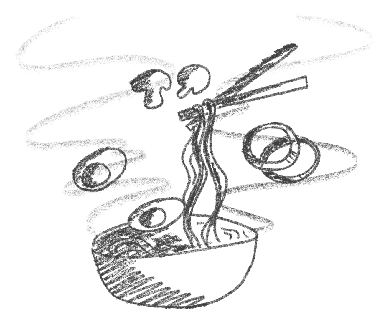
The font I chose is Clarendon Graphic. I think it has a very warm feel, inspiring the authenticity of organic, local and natural products. The curves also give it a friendly feel. It’s still graphic and inspires the rigour of a structured diet. However, the illustrations break up this rigour and give it a very natural, authentic and youthful feel.